Has the Market Lost Its #$%& Mind?
Andy Snyder|September 28, 2022

The stock market has hit new lows.
Like cotton candy in a rainstorm, the profits of the last two years are vanishing with each new dark cloud.
Investors are confused. They’re angry. And, perhaps most dangerous, they’re defeated.
“It’s all a mess,” they say. “The markets are entirely unpredictable and erratic.”
That’s a scary notion. But it explains why some $5 trillion is sitting on the sidelines in cash these days. Investors are paralyzed with fear and uncertainty.
It raises a question… the eternal question.
Has the market lost its #$%& mind?
Put more clearly, what’s the fair value of stocks these days? Are stocks falling because growth prospects really are that much lower? Or are stocks falling because when fear is this high, selling begets selling?
The answers to those questions dictate our strategy.
Profit Talks
Of course, there are many ways to value the stock market. But just three metrics form the foundation for all the other variables. After all, when we’re buying a stock, we’re buying the value of its future profit stream. Growth and profits are where we need to focus.
Of course, a simple price-to-earnings multiple is the classic way of measuring a company’s price tag relative to its profits. It tells us how much the market is willing to pay for each dollar of profit the company is generating. The more growth the market expects… the higher the figure.
At the market’s height last fall, the S&P 500’s P/E ratio stretched above 35.
At that level, investors were willing to pay $35 to own just a dollar’s worth of profit. It was a sky-high figure that factored in immense growth. Or, much more likely, it factored in the maddening stimulant of dirt-cheap money that skewed the rational price of profits.
With companies arbitraging debt for dividends and buybacks… profits weren’t the key. Getting access to the free-money spigot was.
Of course, that spigot has a big, fat thumb on it these days. Money is still cheap, but not like it was.
It explains the sizeable dip in the market’s average P/E. It’s down to 18.5.
It’s a big dip… but does that mean stocks are cheap?
That depends on our timeline. From 1900 to 1980, the average P/E was just north of 13. But as we entered the cheap-money era (remember, rates peaked in the early 1980s), the average rose. For the last 40 years, it’s been close to 22.
So if you believe we’ve seen the death of low rates, stocks are still expensive. But if you’re like us and think the global economy will collapse if Powell keeps pushing rates higher, then things are actually a bit cheap… assuming he’s smart enough to pull back.
We have our doubts.
Basic Buffett
Another way of looking at things has been dubbed the “Buffett Indicator.” It simply measures the stock market against the nation’s GDP. It’s very basic, but it paints a vivid picture.
Over the last 20 years, the stock market has traded at about the same level as GDP. Each time it stretches above the GDP figure (as investors price in extreme growth), the numbers eventually converge.
In 2000, the dot-com bubble pushed the Buffett Indicator two full standard deviations above average. The result wasn’t pretty. The ratio soon plunged to a full standard deviation below average.
In 2021, the Buffet Indicator was almost exactly where it was in 2000.
That’s where the bad news comes in. At today’s prices, we’re still a standard deviation above average. Even with this year’s pain, there’s likely more trouble ahead.
Either stocks need to fall or GDP needs to rise… and yesterday’s real-time GDPNow figures weren’t pretty.
h2>Rate King
Finally… interest rates.
If rates are driving this market (and honey, they are), then we must pay particular attention to the data. The problem here is that the trends are so slow-moving that determining an average is quite tough.
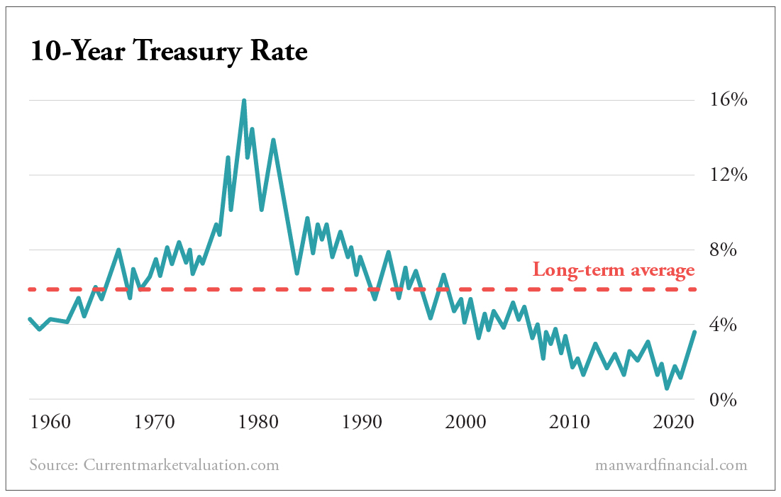
The chart below shows a 6% historical average for the benchmark 10-year Treasury. But is that fair? Rates have been at 6% only a few times in history.
Over the last two decades, 3% is much more in line with reality. Where we see things going depends on whether we believe the era of low rates is coming to an end.
It’s the same with stocks. The chart below makes stocks look quite expensive when compared with the market’s long-term average. But is growth easier to come by in 2022 than it was in 1960? Many would say the premium is fair.
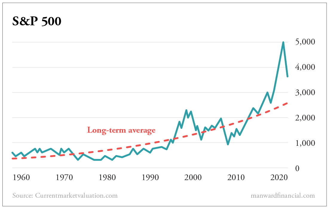
Even so, when we compare the 10-year Treasury with the value of stocks over the long term, we get a figure that is smack dab in line with the historical average.
Put it all together and it tells us one very simple thing.
The market has not lost its mind. It’s simply doing what we’ve long said it would do.
It’s following interest rates like a gander trails his goose.
The higher the Fed takes rates, the lower stocks will go. That’s simply the nature of things – long term, short term and every term in between.
The real question we must ask is…
Has Powell lost his #$%& mind?
More on that soon.