A Simple Guide to Better Trading
Marc Lichtenfeld|August 11, 2021

Editor’s Note: You’re in for a treat today. Our good friend and expert technical trader Marc Lichtenfeld is sharing his secret to more profitable trades in the markets.
Technical indicators like support and resistance can be powerful tools for predicting the short-term movements of a stock. And for a limited time, Marc is offering a free training course on how to use them to improve your trading success.
Marc’s How to Trade Like a Champion series – which reveals chart patterns used by world-record holders and investing champions alike – is available now. The best part? It’s absolutely free to watch. Click here to check it out.
As the ticker symbols and prices whooshed past me continuously, the traders in my office shouted buy and sell orders at me nonstop throughout the trading day.
I couldn’t understand how these traders made sense of the information that flew by us on our screens as they made buy and sell decisions.
This was 25 years ago, when I was a newly minted trading assistant on the trading desk of a small firm, trying to hang on for dear life and figure out what the heck was going on.
A short time later, a friend showed me a book on stock charts and I was hooked. I’d found my holy grail, I thought. The charts would definitively show me which stocks would be winners and which would be losers. Right?
Only it wasn’t quite that simple.
I’ve been studying and using stock charts and technical analysis for more than two decades. Newcomers to the concept (including myself, years ago) mistakenly think the charts are a crystal ball. They’re not.
But what they’re extremely useful for is revealing patterns that have repeated time and time again over the years.
It’s fairly simple when you think about it. The stock market measures greed and fear. If a stock is going up, more people are greedy than fearful. The opposite is true when a stock falls.
Charts are a visual representation of those two emotions playing out in the market.
What technical analysis is best at is helping traders and investors understand their risk and when they can be confident a stock is going to go up, down or sideways.
Two of the easiest concepts to understand are support and resistance. Support is a price level that a stock doesn’t drop below. It acts like a floor. For whatever reason, whenever the stock gets to that area, it stops falling as buyers step in.
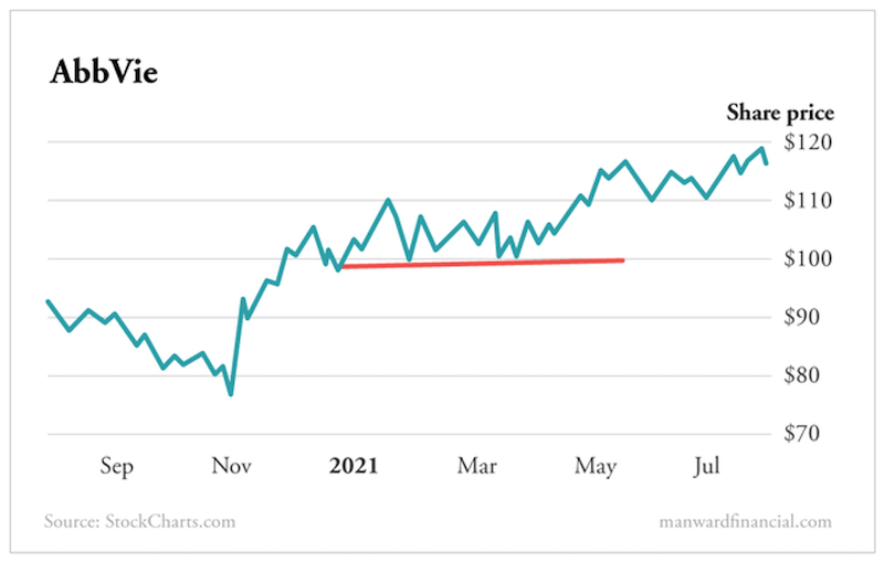
Take a look below at the chart of AbbVie (ABBV). You can see that each time the stock dipped to about $100, it rebounded. We don’t know (or even care that much) why buyers stepped in at that level, but they did, and the stock eventually moved higher.
So, in March, if the stock was trading at $103, you could buy it, feeling confident that if it fell meaningfully below $100, you were probably wrong and could get out with a small loss instead of hoping the stock would rebound.
Here’s an example of broken support – when buyers stopped buying at the support level.
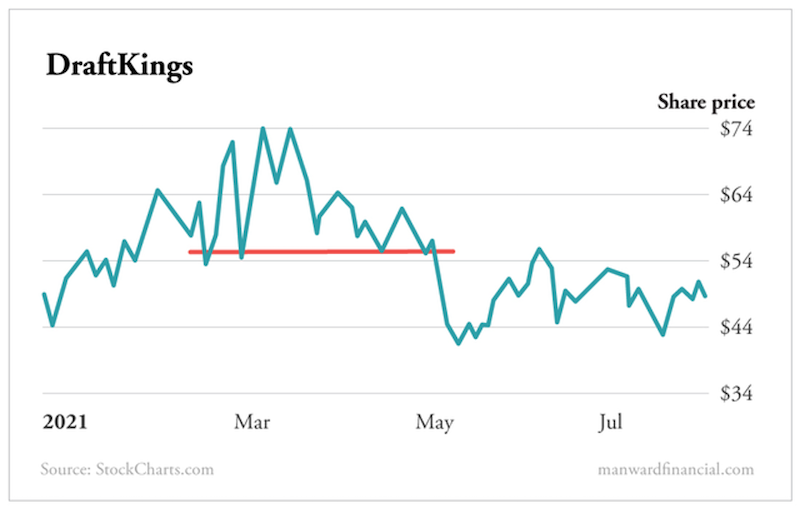
This is what I mean when I say you can use support to understand your risk. DraftKings (DKNG) had a similar pattern, with support around $57. Each time the stock fell to $57, it rebounded (even when it broke through the support for one day each in late February and early March).
But then in May, its support broke, and the stock fell below $57 and kept falling. Once it fell to $54 or so, a trader would know that the stock was unlikely to bounce back in the near term. The buying activity at $57 had dried up.
Resistance is the same as support, but in the opposite direction. It’s a ceiling on a stock. For whatever reason, at a certain price level, sellers overwhelm the buyers and the stock falls.
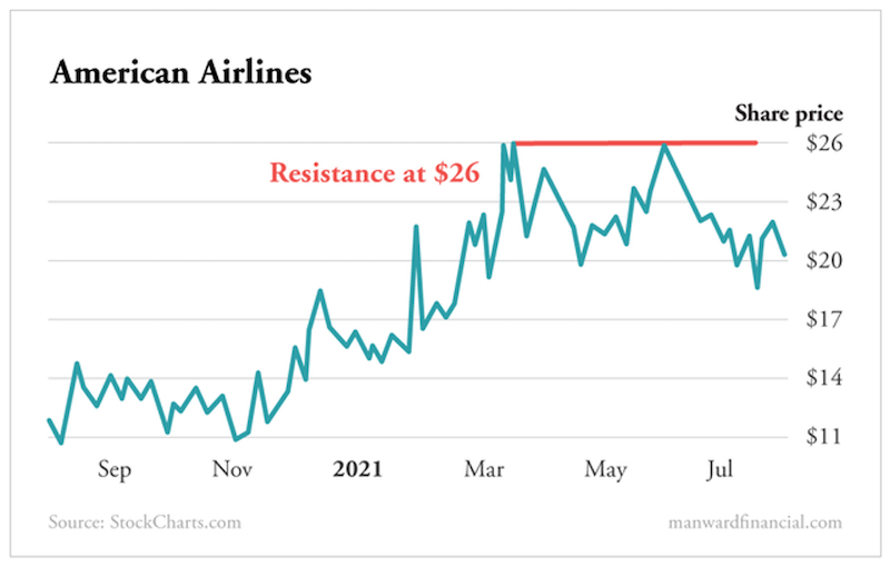
So if you were interested in buying American Airlines (AAL) and it was trading at $24, you’d probably want to wait until it broke $26 so you’d know the sellers weren’t going to dump shares like they had before and push the stock back down.
One last note about support and resistance is that they don’t have to be flat lines at one price. Support and resistance can rise or fall in what’s known as a trend line.
You can see on this chart of the water treatment company Pentair (PNR) that since early 2020, the stock has been in an uptrend, bouncing along a trend line that has been moving higher.
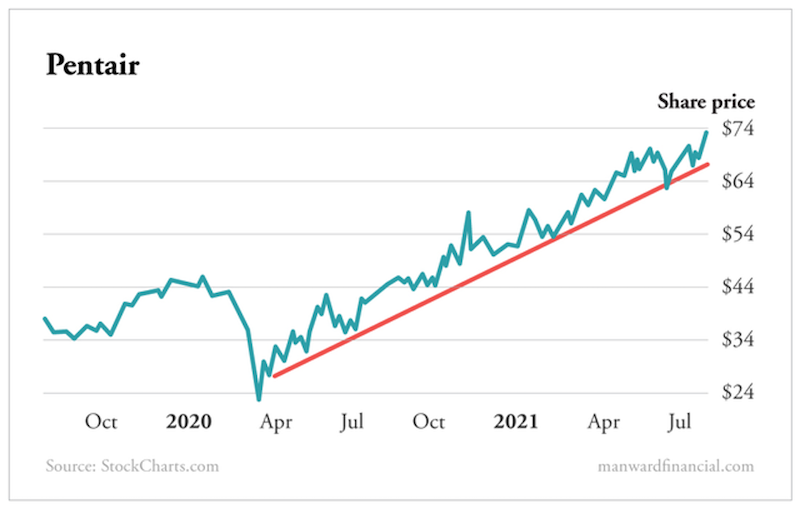
Whenever the stock comes close to or hits the trend line, the trend line acts as support and the stock rises. If the stock breaks below the trend line, we know the uptrend is likely over and a trader should consider exiting the position.
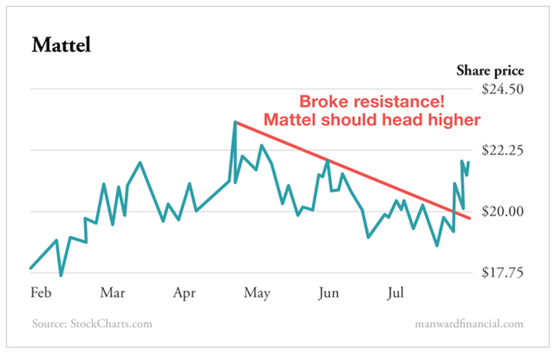
The last chart I’ll show you today is of toy manufacturer Mattel (MAT). The stock had been in a downtrend since April of this year. Every time it approached the trend line, which acted as resistance, it sold off. But last week, it broke through that ceiling, suggesting the sellers are gone and the stock should move higher from here.
Think of support and resistance as floors and ceilings for stocks. Once they are broken, you know things have changed. And remember, stock charts and other analytical tools are not going to be right 100% of the time, but they shine a light on significant changes in investor psychology.
If used properly, these charts will help you minimize your losses and optimize your entry points.
Note: Ready for the chance to supercharge your returns by using chart patterns? Join my free online training course. Simply click here to check it out!